

Choosing the right colour scheme for your website is one of the most critical decisions in the design process. Colours have a powerful impact on how visitors perceive your brand, interact with your content, and remember your site. A well-chosen colour scheme not only enhances the aesthetic appeal of your website but also supports usability, accessibility, and brand identity. In this guide, we’ll walk you through the essential steps to select a colour scheme that not only looks great but also resonates with your audience and reinforces your brand.
Understanding the Basics of Colour Theory
Before exploring specific colours, it’s important to grasp the basics of colour theory. This foundation will help you make informed decisions when selecting colours that work well together.
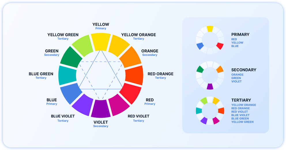
Primary, Secondary, and Tertiary colours
- Primary colours: Red, blue, and yellow — these cannot be created by mixing other colours.
- Secondary colours: Green, orange, and purple — created by mixing two primary colours.
- Tertiary colours: A mix of primary and secondary colours, resulting in hues like red-orange and blue-green.
Colour Schemes
- Complementary: Colours opposite each other on the colour wheel (e.g., blue and orange). These colours create high contrast and are visually striking.
- Analogous: Colours next to each other on the colour wheel (e.g., blue, blue-green, and green). These colours create a harmonious, serene look.
- Triadic: Three colours evenly spaced on the colour wheel (e.g., red, yellow, and blue). This scheme offers vibrant and balanced contrast.
Warm vs. Cool Colours
- Warm colours: Reds, oranges, and yellows—these evoke energy and warmth.
- Cool colours: Blues, greens, and purples—these evoke calmness and tranquillity.
Aligning Your Colour Scheme with Your Brand Identity
Your website’s colour scheme should be a reflection of your brand’s identity. Colours can convey the essence of your brand, making it crucial to choose shades that align with your brand values and personality.
- Understand Your Brand’s Personality: Is your brand bold and energetic, or calm and trustworthy? Identifying your brand’s core attributes will guide your colour choices. For example, a tech startup might choose cool, modern colours like blue and grey, while a children’s brand might opt for bright, playful colours like yellow and green.
- Brands With Strong Colour Associations: Consider brands like Coca-Cola with its iconic red, which represents energy and passion, or Apple with its sleek, modern silver, which communicates innovation and simplicity. These brands have used colour effectively to strengthen their identity.
- Choosing a Primary colour: Your primary colour should be the one most associated with your brand. It’s the colour that will dominate your website and be the most recognizable aspect of your visual identity.
Considering Your Target Audience
Different audiences respond to colours in various ways, influenced by factors such as age, gender, and cultural background. Understanding your target audience can help you choose colours that resonate with them.
- Demographic Influence on Colour Preferences: Research shows that certain colours appeal more to specific demographics. For instance, younger audiences might prefer bold, vibrant colours, while older demographics might gravitate towards more subdued, classic tones.
- Examples of Tailored Colour Choices: A luxury brand targeting high-income professionals might choose sophisticated colours like black and gold, while a health and wellness brand might opt for calming greens and blues.
The Psychological Impact of Colours
Colours evoke emotions and influence behaviour, a concept known as colour psychology. Understanding the psychological impact of colours can help you choose a scheme that aligns with the emotional response you want to evoke from your audience.
Overview of Colour Psychology
- Blue: Trust, professionalism, calmness (often used by financial institutions and tech companies).
- Red: Energy, passion, urgency (common in retail and food industries).
- Green: Health, growth, tranquillity (popular in wellness and environmental sectors).
- Yellow: Optimism, warmth, caution (used to grab attention or create a cheerful atmosphere).
Tips for Selecting colours
Choose colours that align with the emotions and actions you want to inspire in your visitors. For example, if you want to encourage a sense of security and trust, blue might be a strong choice for your primary colour.
Balancing Aesthetics and Functionality
A great colour scheme is not just about aesthetics—it also needs to be functional. This means ensuring that your website is accessible, readable, and user-friendly.
- Importance of Contrast: High contrast between text and background colours is essential for readability. This is especially important for users with visual impairments. Tools like colour contrast checkers can help you ensure your choices meet accessibility standards.
- Using Accent colours Effectively: Accent colours should be used sparingly to draw attention to key elements like buttons, links, or calls to action. Too many accent colours can be overwhelming, so stick to one or two complementary shades.
- The Role of White Space: White space, or negative space, is the area around design elements. It helps to avoid clutter and allows your colours to stand out. A balanced use of white space makes your design more readable and visually appealing.
Creating a Cohesive Colour Palette
A cohesive colour palette ties together all the elements of your website, creating a harmonious and professional look.
- Choosing Harmonious Colours: Use a colour wheel to select colours that work well together. Complementary colours can add vibrancy, while analogous colours create a more serene, unified look.
- Tools for Generating colour Palettes: Use Adobe Colour Picker or Coolors
- Combining Shades and Tones: Use different shades (darker versions) and tints (lighter versions) of your chosen colours to add depth and variety to your palette without introducing new colours.
Examples of great website colour schemes
Learning from others can provide inspiration and practical insights into what works well.
Airbnb: Soft Pinks and Whites for Comfort and Warmth
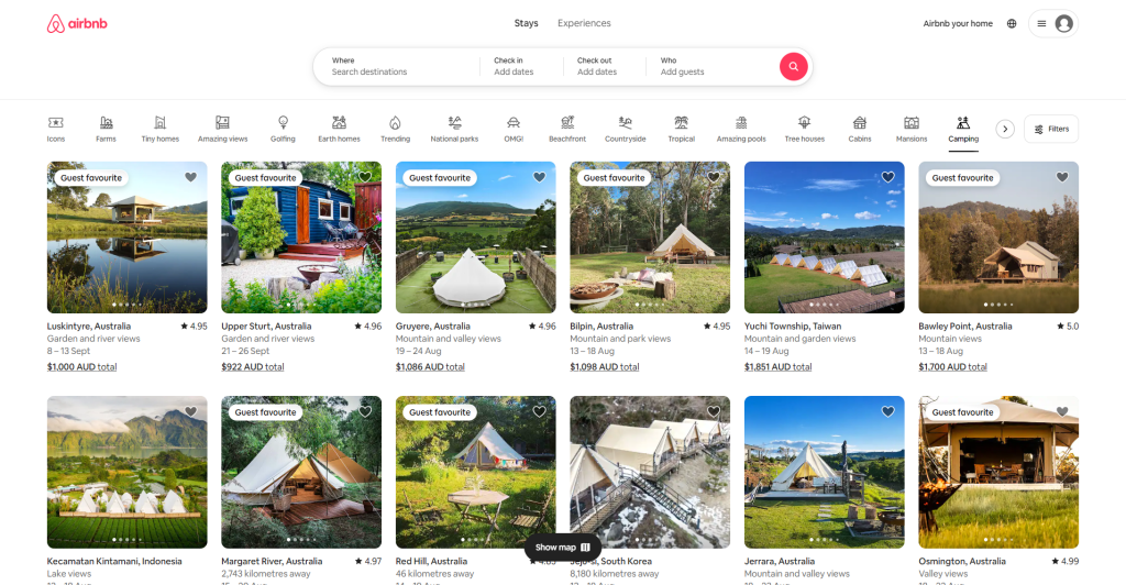
Why It Works: Airbnb’s colour scheme of soft pinks, whites, and pastels creates an inviting, warm, and friendly atmosphere. These colours resonate with the brand’s mission of making people feel at home anywhere in the world. The softness of the colour palette reflects comfort and hospitality, which are core to Airbnb’s values.
How It’s Applied:
- Emotional Connection: The use of soft, warm colours evokes feelings of safety, comfort, and belonging—emotions that are crucial for a platform that connects travelers with homes and experiences.
- Inclusive Design: The pastel palette is inclusive and non-threatening, appealing to a broad audience by avoiding overly bold or aggressive colours. This inclusivity helps Airbnb reach a diverse global audience.
- Focus on Visual Content: The light, airy background allows photos of homes and experiences to stand out, making the listings more appealing and the browsing experience more enjoyable.
Dropbox: Blue and White for Professionalism and Clarity

Why It Works: Dropbox’s colour scheme of blue and white is a classic choice that communicates professionalism, trust, and reliability. Blue is often associated with trustworthiness and security, which are key attributes for a service that manages and stores important files for millions of users.
How It’s Applied:
- Trust and Security: Blue is the colour of choice for many tech companies because it is associated with stability and reliability. Dropbox’s use of blue reinforces the idea that your data is safe and secure with them.
- Clean and Uncluttered Design: The white background provides a clean, uncluttered canvas that makes the blue elements—like buttons and headers—stand out. This simplicity ensures that users can navigate the platform effortlessly.
- Universal Appeal: Blue is a universally liked colour, making it a safe choice for a global platform. It appeals to a wide audience, including businesses, professionals, and individuals.
Coca-Cola: Bold Red for Energy and Excitement
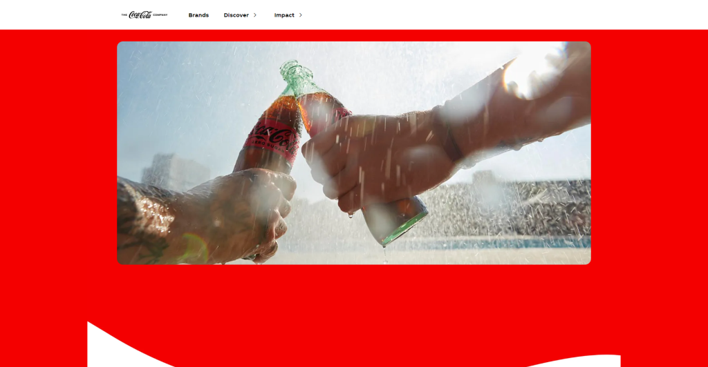
Why It Works: Coca-Cola’s iconic red colour is instantly recognizable and is a key part of its brand identity. Red is associated with energy, excitement, and passion, which aligns perfectly with Coca-Cola’s image as a fun, vibrant, and refreshing beverage.
How It’s Applied:
- Immediate Recognition: The use of red ensures instant brand recognition across the globe. The strong association with Coca-Cola makes the colour an integral part of its identity.
- Emotional Impact: Red is a stimulating colour that can increase appetite and evoke feelings of excitement and enthusiasm, which are desirable emotions for a beverage brand.
- Consistency: Coca-Cola has consistently used red across all of its branding and marketing materials, from packaging to advertisements. This consistency strengthens brand loyalty and trust.
Apple: Sleek Silver and Minimalist White for Innovation and Simplicity
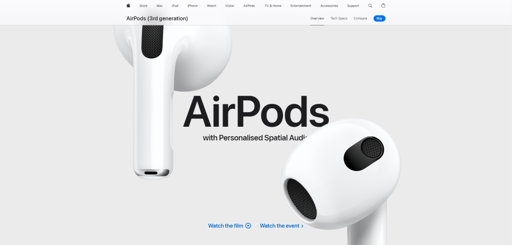
Why It Works: Apple’s choice of sleek silver and minimalist white reflects the brand’s commitment to innovation, elegance, and simplicity. These colours align with Apple’s product design philosophy, which emphasizes clean lines, modern aesthetics, and user-friendly interfaces.
How It’s Applied:
- Modern and High-Tech: The use of silver and white gives Apple’s website a modern, high-tech look that resonates with its cutting-edge products.
- Focus on Products: The minimalist colour scheme ensures that the focus remains on the products, not the design elements. This approach highlights the beauty and functionality of Apple’s products.
- Premium Feel: The combination of silver and white exudes a sense of luxury and exclusivity, reinforcing Apple’s status as a premium brand.
Applying These Lessons to Your Website
When selecting a colour scheme for your website, consider how these successful brands have leveraged colour to communicate their identity and connect with their audience. Choose colours that not only reflect your brand’s personality but also evoke the desired emotional response from your users. Remember to maintain consistency across your branding to strengthen recognition and trust. Whether you’re aiming for vibrant energy, professional trust, or comforting warmth, your colour choices can make a significant impact on how your brand is perceived.
By understanding why these brands’ colour choices work, you can apply similar principles to create a colour scheme that enhances your website’s effectiveness and supports your overall branding strategy.
Bringing Your Website to Life with the Perfect Colour Scheme
Choosing the perfect colour scheme for your website is both an art and a science. By understanding colour theory, aligning your choices with your brand and audience, and balancing aesthetics with functionality, you can create a website that not only looks great but also enhances user experience and strengthens your brand. Remember, the right colours can make a powerful first impression and keep visitors engaged with your content.
Ready to bring your vision to life? With VIPSites, VentraIP’s free website builder, you can easily apply your chosen colour scheme and design a stunning, professional-looking website without any coding skills. VIPSites offers intuitive tools and customizable templates that make it simple to create a website that truly reflects your brand. Whether you’re starting a new business, launching a personal blog, or showcasing your portfolio, VIPSites has everything you need to get online quickly and easily.
Get started today and see how easy it is to build a beautiful website with VIPSites. Your perfect colour scheme is just the beginning!
Further reading: Website Layout Ideas to Kickstart Your Creativity