

A well-designed website layout is crucial for creating a user-friendly experience, guiding visitors through your content, and ultimately achieving your website’s goals. The layout is more than just arranging elements on a page; it’s about crafting a visual journey that engages users, reflects your brand identity, and enhances usability. If you’re looking to refresh your website or start from scratch, here are some creative layout ideas to inspire your next project.
Understanding the Basics of Website Layout Design
Before diving into specific layout ideas, it’s essential to understand the fundamentals of website layouts. Common structures include grid-based, single-page, and multi-page designs, each offering unique benefits depending on your content and audience.
- Grid-Based Layouts: These are structured and predictable, making them ideal for websites with a lot of content that needs to be organised neatly.
- Single-Page Layouts: Perfect for storytelling or presenting a linear narrative, these layouts keep all content on one page, making it easy to navigate.
- Multi-Page Layouts: These are traditional and best suited for websites with diverse content. They allow users to explore different sections at their own pace.
Responsive design is also a critical consideration, ensuring your website looks great and functions well across all devices.
Tips for Choosing the Right Layout for Your Website
- Align with your goals: Choose a layout that supports your website’s goals, whether it’s driving conversions, showcasing a portfolio, or sharing content.
- Consider your audience: Your layout should reflect the preferences and needs of your target audience. For example, a younger audience might prefer more interactive and dynamic layouts, while a professional audience might appreciate a clean and straightforward design.
- Test and Refine: Always test your layout on different devices and gather user feedback. This will help you identify any issues and refine the design to better meet your audience’s needs.
Different Types Of Website Layouts
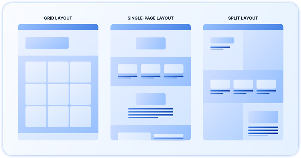
Grid
- The Basics: Grid layouts are the backbone of web design, providing a structured framework for content.
- Why It Works: Grid layouts are the backbone of web design, providing a structured framework for content. Try asymmetrical grids, where elements of varying sizes overlap or break out of the traditional grid structure. This adds a dynamic feel to the layout while maintaining order.
Single-Page
- The Basics: Single-page layouts are ideal for storytelling or presenting a streamlined user journey.
- Why It Works: Single-page layouts are ideal for storytelling or presenting a streamlined user journey. Incorporate parallax scrolling, where background images move at a different speed than foreground content. This effect can add depth and intrigue to your design.
Split-Screen
- The Basics: Split-screen layouts divide the screen into two sections, often highlighting two equally important pieces of content.
- Why It Works: Split-screen layouts divide the screen into two sections, often highlighting two equally important pieces of content. Use contrasting colours or typography on each side to create a visual tension that draws the user’s attention. This can be particularly effective for sites that need to showcase dual offerings or concepts.
Broken Grid
- The Basics: Broken grids disrupt the traditional grid structure, creating a more organic and less predictable layout.
- Why It Works: Broken grids disrupt the traditional grid structure, creating a more organic and less predictable layout. This approach adds visual interest and can give your website a modern, cutting-edge feel. It’s perfect for creative industries like design, fashion, or media.
F-Pattern
- The Basics: The F-Pattern layout mimics the natural reading pattern of users, which typically starts at the top left of the screen and moves horizontally before descending vertically. This pattern is often seen in content-heavy websites like blogs, news portals, and articles, where users scan content in an F-shaped pattern.
- Why It Works: The F-Pattern layout is effective because it aligns with how users naturally read and scan content, especially when they are looking for specific information. By placing important elements like headlines, images, and calls to action along the F-shape, you can capture user attention more efficiently. This layout is particularly useful for text-heavy pages, ensuring that key information is easily noticed by visitors.
Z-Pattern
- The Basics: The Z-Pattern layout guides the user’s eye in a zigzag motion, starting from the top left of the screen, moving horizontally across to the top right, then diagonally down to the bottom left, and finally across to the bottom right. This layout is often used in simple, less content-heavy websites, such as landing pages, where the focus is on guiding users to a specific action.
- Why It Works: The Z-Pattern layout is ideal for designs where the goal is to lead users through a specific flow, such as from a headline to a call to action. By strategically placing key elements along the Z-shaped path, you can ensure that users follow the intended visual journey, which ultimately drives engagement and conversions. This layout works particularly well for sites that rely on strong visuals and concise messaging to capture attention.
Full-Screen Image
- The Basics: Full-screen images are bold and immersive, making a strong visual statement.
- Why It Works: Full-screen images are bold and immersive, making a strong visual statement. Use high-quality visuals that dominate the screen to captivate users from the moment they land on your site. Add minimal text overlays or call-to-actions to keep the focus on the imagery.
Card-Based
- The Basics: Card layouts organise content into cards, which are individual blocks of information.
- Why It Works: Card layouts organise content into cards, which are individual blocks of information. Cards are flexible and work well for content-heavy sites like blogs or e-commerce stores.
Whitespace-Driven
- The Basics: Whitespace, or negative space, is the empty area between design elements.
- Why It Works: Emphasize your content by surrounding it with ample whitespace, creating a clean and uncluttered design. This not only improves readability but also gives your website a sophisticated, modern aesthetic.
Center-Aligned
- The Basics: Center-aligning content creates a focal point in the middle of the page.
- Why It Works: This layout is ideal for minimal content or a single, strong call-to-action. It creates a sense of balance and directs the user’s attention exactly where you want it.
Essential Elements of an Effective Homepage Layout
When designing the layout of a home page, it’s crucial to include sections that not only provide necessary information but also engage and guide your visitors through your website. Each section serves a unique purpose and contributes to the overall user experience. Here’s a breakdown of the essential sections your home page should include:
1. Hero Banner
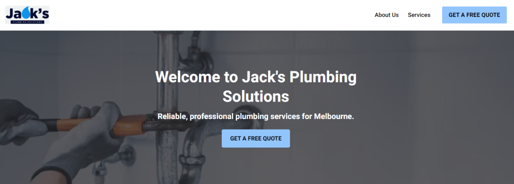
The Hero Banner is the first section visitors see when they land on your website. It typically spans the full width of the page and features a compelling image or video, a concise headline, and a strong call-to-action (CTA). The Hero Banner sets the tone for your brand and immediately grabs attention. It’s an opportunity to convey your brand’s message or highlight a key offering, encouraging users to explore further.
Key Elements:
- Eye-catching imagery or video
- Clear, concise headline
- A strong, actionable CTA (e.g., “Learn More,” “Shop Now”)
- Optionally, include a brief subheading or a short description to provide context
2. About Us
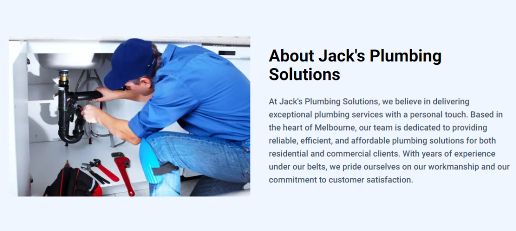
The About Us section provides visitors with insights into who you are as a business. This section is where you can share your story, mission, values, and what makes your brand unique. It’s an opportunity to build trust and connect with your audience on a more personal level.
Key Elements:
- A brief history of your company
- Your mission and values
- Key achievements or milestones
- A link to a more detailed “About Us” page if available
3. Services
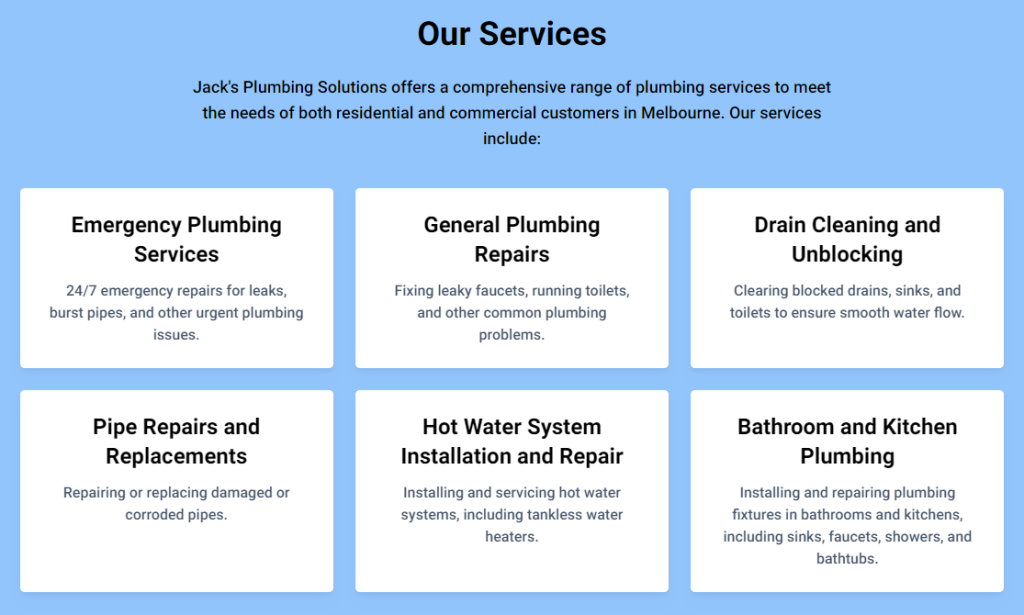
This section highlights what you offer—whether it’s products, services, or both. It’s crucial to clearly display what your business provides to help visitors quickly understand if you can meet their needs. High-quality images, brief descriptions, and links to more detailed pages can make this section effective.
Key Elements:
- Featured products or services with images
- Short descriptions explaining the benefits or key features
- Links to individual product or service pages for more information
- Option to add a CTA, such as “View All Products” or “See Our Services”
5. Team
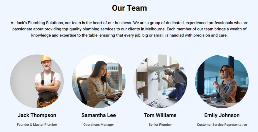
The Team section introduces the people behind your brand. It’s an opportunity to humanize your business by showing the faces and stories of those who make your company what it is. This can help build a connection with your audience and demonstrate the expertise and passion within your team.
Key Elements:
- Photos of key team members
- Brief bios highlighting roles, experience, and specialisations
- Links to detailed profiles, LinkedIn pages, or team blogs
- Optional: Include a short introduction or statement from the founder or CEO
6. Testimonials
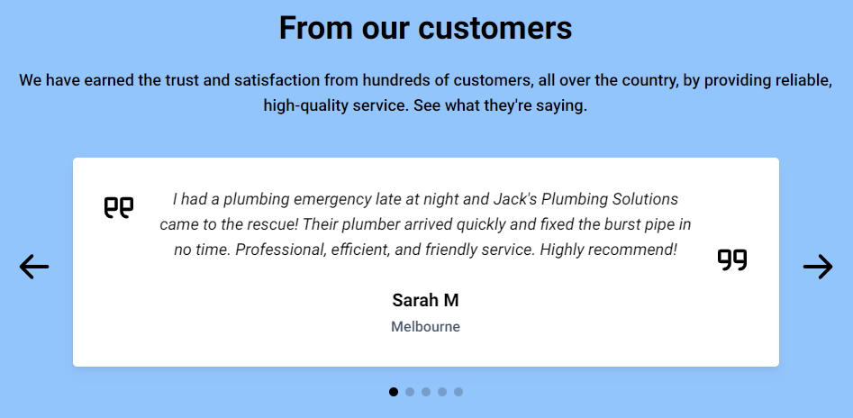
Testimonials are a powerful tool for building credibility and trust. The Testimonials section showcases positive feedback from your customers or clients, providing social proof that others have had a great experience with your business.
Key Elements:
- Quotes from satisfied customers or clients
- Names and, if applicable, photos or job titles of those giving the testimonials
- Links to case studies or detailed reviews if available
- Optionally, include star ratings or scores if relevant
7. FAQs
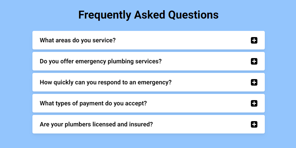
The Frequently Asked Questions (FAQs) section addresses common inquiries your visitors may have. This section not only helps reduce the number of support requests but also demonstrates your commitment to transparency and customer service.
Key Elements:
- A list of common questions with clear, concise answers
- Topics may include shipping, returns, services, pricing, etc.
- Option to link to a more comprehensive FAQ page
- Consider organising FAQs into categories for easy navigation
8. Call to Action (CTA)
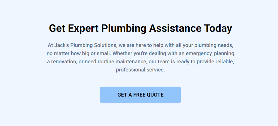
Every home page should include a strong Call to Action (CTA) to guide visitors towards the next step. Whether it’s signing up for a newsletter, scheduling a consultation, or making a purchase, a well-placed CTA can significantly increase conversions.
Key Elements:
- A clear, compelling message encouraging the user to take action (e.g., “Get Started Today”)
- Placement in a prominent location (e.g., Hero Banner, middle of the page, or at the bottom)
- A clickable button or link that stands out visually
- Optionally, include multiple CTAs throughout the page for different actions (e.g., “Contact Us” and “Shop Now”)
9. Contact Us
The Contact Us section is an essential component of your home page, providing visitors with a straightforward way to get in touch with your business. It typically includes multiple contact methods, ensuring that users can reach out in the way that best suits them. This section is crucial for building trust, offering customer support, and encouraging inquiries or feedback. By making it easy for visitors to contact you, you enhance the user experience and increase the likelihood of conversions.
Key Elements:
- Contact Form: A simple, user-friendly form where visitors can enter their name, email address, and a message or inquiry. This form should be easy to find and submit.
- Phone Number: Display your phone number prominently, ensuring it is clickable on mobile devices for easy access.
- Email Address: Include an email address with a “mailto:” link, making it convenient for users to send you an email directly.
- Physical Address: If applicable, provide your business’s physical address, along with a map or link to Google Maps for easy navigation.
- Business Hours: List your business hours so visitors know when they can expect a response or when your physical location is open.
Ready to Bring Your Website Vision to Life?
Designing a website with a creative layout doesn’t have to be complicated. With the right tools and a bit of inspiration, you can create a visually stunning and highly functional website that resonates with your audience. If you’re ready to bring your ideas to life, VentraIP’s free website builder, VIPSites, makes it easy to create a beautiful, professional-looking website without much effort. With intuitive tools and customisable templates, VIPSites allows you to experiment with different layouts, add your own unique touches, and launch a site that looks and performs great on any device.
Don’t wait — start building your dream website today with VIPSites and see how easy it is to create something truly special.
Further reading: An In-Depth Guide To Choosing A Website Colour Scheme